FLUTTER INTRO SLIDER

FLUTTER INTRO SLIDER:

In this tutorial, we are going to study Intro Slider Screens in Flutter App. Intro slider Screens or introduction Slider Screens are used to display the major and important product of your app or your business. this will attracts user attention more to grow your business. Intro Sliders are more helpful for an e-commerce business to showcase their important categories with popular products and also for educational institutions to showcase their famous courses to the students, etc.

Using this intro slider you can change your image, button, text style, color and many more you can do with this intro slider, It is very easy to create intro slider screens in Flutter.

To create Intro Slider Screens in Flutter App:

Follow the below steps to Create Intro Screens in Flutter App.

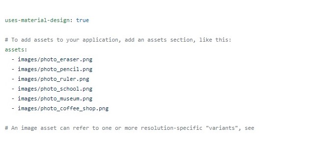
Add dependency package:

Use the below code to add dependency package to  pubspec.yaml file as shown. After adding the dependency package run the get package method to import all the required files.


dependencies:
intro_slider: ^1.2.1

Install the Package:

We can also install the package from the command line using the below code as shown.

$ flutter packages get

Import the Package:

After adding the package to pubspec.yaml file, we can now import it into the dart file. without adding into pubspec.yaml file if we import it will show package not found an error. Use the below code to import the package into your dart file and then run the get package method to import all the dependencies into your dart file. 

import 'package:intro_slider/intro_slider.dart';

List of Slide object attributes:

Name Type Default Description
Title      
title String “” Change text title at top
maxLineTitle int 1 Change max number of lines title at the top
styleTitle TextStyle White color, bold and font size is 30.0 The style for a text title
marginTitle EdgeInsets top: 70.0, bottom: 50.0 The margin for a text title

For Image:

 Name Type Default Description
pathImage String “” Path to your local image
widthImage double 250.0 Width of image
heightImage double 250.0 Height of image
onCenterItemPress Function Do nothing Fire when press image

For Center Widget:

Name Type Default Description
centerWidget Widget null Your custom’s widget
onCenterItemPress Function Do nothing Fire when pressing center widget

For Description:

Name Type Default Description
description String “” Change text description at the bottom
maxLineTextDescription String 100 Maximum line of text description
styleDescription TextStyle White and font size is 18.0 A style for a text description
marginDescription EdgeInsets left, right = 20.0, top, bottom = 50.0 The margin for the text description


For Background Color:

Name Type Default Description
backgroundColor Color Color(0xfff5a623) Background tab color
colorBegin Color null Gradient tab color begin
colorEnd Color null Gradient tab color end
directionColorBegin AlignmentGeometry null Direction color begin
directionColorEnd AlignmentGeometry null Direction color end

For Background Image:

Name Type Default Description
backgroundImage String null Background tab image
backgroundImageFit BoxFit BoxFit.cover Background tab image fit
backgroundOpacity double 0.5 Background tab image filter opacity
backgroundOpacityColor Color Colors.black Background tab image filter color
backgroundBlendMode BlendMode BlendMode.darken Background tab image filter blend mode


List fo Intro Slider widget attributes:

Name Type Default Description
Slide      
slides Slide No default, required An array of Slide object
Skip Button      
renderSkipBtn Widget Button with text SKIP Render your own SKIP button
widthSkipBtn double 1/4 screen width Width of view wrapper SKIP button
onSkipPress Function Go to last page Fire when press SKIP button
nameSkipBtn String “SKIP” Change SKIP to any text you want
styleNameSkipBtn TextStyle White color The style for text at SKIP button
colorSkipBtn Color transparent Color for SKIP button
highlightColorSkipBtn Color Color(0x4dffffff) Color for SKIP button when pressing
isShowSkipBtn bool true Show or hide the SKIP button
borderRadiusSkipBtn double 30.0 Rounded SKIP button


For Prev Button:

Name Type Default Description
renderPrevBtn Widget Button with text PREV Render your own PREV button
widthPrevBtn double 1/4 screen width Width of view wrapper PREV button
namePrevBtn String “PREV” Change PREV to any text you want
styleNamePrevBtn TextStyle White color A style for text at PREV button
colorPrevBtn Color transparent Color for PREV button
highlightColorPrevBtn Color Color(0x4dffffff) Color for PREV button when press
isShowPrevBtn bool false Show or hide PREV button
borderRadiusPrevBtn double 30.0 Rounded PREV button


For Done Button:

Name Type Default Description
renderDoneBtn Widget Button with text DONE Render your own DONE button
widthDoneBtn double 1/4 screen width Width of view wrapper DONE button
onDonePress Function Do nothing Fire when press DONE button
nameDoneBtn String “DONE” Change DONE to any text you want
styleNameDoneBtn TextStyle White color The style for text at DONE button
colorDoneBtn Color transparent Color for DONE button
highlightColorDoneBtn Color Color(0x4dffffff) Color for DONE button when pressing
borderRadiusDoneBtn double 30.0 Rounded DONE button


For Next Button:

(other attributes will have the same Done btn).

Name Type Default Description
renderNextBtn Widget Button with text NEXT Render your own NEXT button
nameNextBtn String “NEXT” Change NEXT to any text you want


For Dot Indicator:

Name Type Default Description
isShowDotIndicator bool true Show or hide dot indicator
colorDot Color Color(0x80000000) Color for dot when passive
colorActiveDot Color Color(0xffffffff) Color for dot when active
sizeDot double 8.0 Size of each dot

For Locale:

Name                  Type                      Default                                       Description
locale String ‘en’ ‘en’ or ‘ar’ to set the default locale and adjust the direction of widgets


For Status Bar:

Name Type Default Description
shouldHideStatusBar bool false Show or hide the status bar


For Behavior:

Name                  Type     Default    Description
isScrollable bool true Force button-only scrolling


Adding the Images:

Create an asset folder in flutter directory and inside that create a images folder and add the images in this location.  After adding the images. make the following changes means uncomment assets in pubspec.yaml and add the images with its path structures. as shown in the below image.

Complete Example Code For Flutter Intro Slider:

import 'package:flutter/material.dart';
import 'package:intro_slider/intro_slider.dart';

void main() => runApp(new MyApp());

class MyApp extends StatelessWidget {
@override
Widget build(BuildContext context) {
return MaterialApp(
home: MySplashScreen(),
debugShowCheckedModeBanner: false,
);
}
}

class MySplashScreen extends StatefulWidget {
MySplashScreen({Key key}) : super(key: key);

@override
MySplashScreenState createState() => new MySplashScreenState();
}

// Custom config
class MySplashScreenState extends State {
List slides = new List();

@override
void initState() {
super.initState();

slides.add(
new Slide(
title:
"A VERY LONG TITLE A VERY LONG TITLE A VERY LONG TITLE A VERY LONG TITLE A VERY LONG TITLE A VERY LONG TITLE A VERY LONG TITLE A VERY LONG TITLE A VERY LONG TITLE",
maxLineTitle: 2,
styleTitle: TextStyle(
color: Colors.white,
fontSize: 30.0,
fontWeight: FontWeight.bold,
fontFamily: 'RobotoMono'),
description:
"Lorem ipsum dolor sit amet, consectetuer adipiscing elit. Aenean commodo ligula eget dolor. Aenean massa. Cum sociis natoque penatibus et magnis dis parturient montes, nascetur ridiculus mus. Donec quam felis, ultricies nec, pellentesque eu, pretium quis, sem. Nulla consequat massa quis enim. Donec pede justo, fringilla vel, aliquet nec, vulputate eget, arcu. In enim justo, rhoncus ut, imperdiet a, venenatis vitae, justo. Nullam dictum felis eu pede mollis pretium. Integer tincidunt. Cras dapibus. Vivamus elementum semper nisi. Aenean vulputate eleifend tellus. Aenean leo ligula, porttitor eu, consequat vitae, eleifend ac, enim. Aliquam lorem ante, dapibus in, viverra quis, feugiat a, tellus. Phasellus viverra nulla ut metus varius laoreet. Quisque rutrum. Aenean imperdiet. Etiam ultricies nisi vel augue. Curabitur ullamcorper ultricies nisi. Nam eget dui. Etiam rhoncus. Maecenas tempus, tellus eget condimentum rhoncus, sem quam semper libero, sit amet adipiscing sem neque sed ipsum. Nam quam nunc, blandit vel, luctus pulvinar, hendrerit id, lorem. Maecenas nec odio et ante tincidunt tempus. Donec vitae sapien ut libero venenatis faucibus. Nullam quis ante. Etiam sit amet orci eget eros faucibus tincidunt. Duis leo. Sed fringilla mauris sit amet nibh. Donec sodales sagittis magna. Sed consequat, leo eget bibendum sodales, augue velit cursus nunc,",
styleDescription: TextStyle(
color: Colors.white,
fontSize: 20.0,
fontStyle: FontStyle.italic,
fontFamily: 'Raleway'),
marginDescription:
EdgeInsets.only(left: 20.0, right: 20.0, top: 20.0, bottom: 70.0),
centerWidget: Text("Replace this with a custom widget",
style: TextStyle(color: Colors.white)),
colorBegin: Color(0xffFFDAB9),
colorEnd: Color(0xff40E0D0),
backgroundImage: 'images/photo_eraser.png',
directionColorBegin: Alignment.topLeft,
directionColorEnd: Alignment.bottomRight,
onCenterItemPress: () {},
),
);
slides.add(
new Slide(
title: "MUSEUM",
styleTitle: TextStyle(
color: Color(0xffD02090),
fontSize: 30.0,
fontWeight: FontWeight.bold,
fontFamily: 'RobotoMono'),
description:
"Ye indulgence unreserved connection alteration appearance",
styleDescription: TextStyle(
color: Color(0xffD02090),
fontSize: 20.0,
fontStyle: FontStyle.italic,
fontFamily: 'Raleway'),
pathImage: "images/photo_museum.png",
colorBegin: Color(0xffFFFACD),
colorEnd: Color(0xffFF6347),
directionColorBegin: Alignment.topRight,
directionColorEnd: Alignment.bottomLeft,
),
);
slides.add(
new Slide(
title: "COFFEE",
styleTitle: TextStyle(
color: Color(0xffD02090),
fontSize: 30.0,
fontWeight: FontWeight.bold,
fontFamily: 'RobotoMono'),
description:
"Much evil soon high in hope do view. Out may few northward believing attempted. Yet timed being songs marry one defer men our. Although finished blessing do of",
styleDescription: TextStyle(
color: Color(0xffD02090),
fontSize: 20.0,
fontStyle: FontStyle.italic,
fontFamily: 'Raleway'),
pathImage: "images/photo_coffee_shop.png",
colorBegin: Color(0xffFFA500),
colorEnd: Color(0xff7FFFD4),
directionColorBegin: Alignment.topCenter,
directionColorEnd: Alignment.bottomCenter,
maxLineTextDescription: 3,
),
);
}

void onDonePress() {
// Do what you want
}

Widget renderNextBtn() {
return Icon(
Icons.navigate_next,
color: Color(0xffD02090),
size: 35.0,
);
}

Widget renderDoneBtn() {
return Icon(
Icons.done,
color: Color(0xffD02090),
);
}

Widget renderSkipBtn() {
return Icon(
Icons.skip_next,
color: Color(0xffD02090),
);
}

@override
Widget build(BuildContext context) {
return new IntroSlider(
// List slides
slides: this.slides,

// Skip button
renderSkipBtn: this.renderSkipBtn(),
colorSkipBtn: Color(0x33000000),
highlightColorSkipBtn: Color(0xff000000),

// Next button
renderNextBtn: this.renderNextBtn(),

// Done button
renderDoneBtn: this.renderDoneBtn(),
onDonePress: this.onDonePress,
colorDoneBtn: Color(0x33000000),
highlightColorDoneBtn: Color(0xff000000),

// Dot indicator
colorDot: Color(0x33D02090),
colorActiveDot: Color(0xffD02090),
sizeDot: 13.0,

// Locale
locale: 'en',

// Show or hide status bar
shouldHideStatusBar: true,
);
}
}

//Default config
//class MySplashScreenState extends State {
// List slides = new List();
//
// @override
// void initState() {
// super.initState();
//
// slides.add(
// new Slide(
// title: "ERASER",
// description: "Allow miles wound place the leave had. To sitting subject no improve studied limited",
// pathImage: "images/photo_eraser.png",
// backgroundColor: Color(0xfff5a623),
// ),
// );
// slides.add(
// new Slide(
// title: "PENCIL",
// description: "Ye indulgence unreserved connection alteration appearance",
// pathImage: "images/photo_pencil.png",
// backgroundColor: Color(0xff203152),
// ),
// );
// slides.add(
// new Slide(
// title: "RULER",
// description:
// "Much evil soon high in hope do view. Out may few northward believing attempted. Yet timed being songs marry one defer men our. Although finished blessing do of",
// pathImage: "images/photo_ruler.png",
// backgroundColor: Color(0xff9932CC),
// ),
// );
// }
//
// void onDonePress() {
// // Do what you want
// }
//
// @override
// Widget build(BuildContext context) {
// return new IntroSlider(
// slides: this.slides,
// onDonePress: this.onDonePress,
// );
// }
//}

Congratulations You Have Learned Creating Intro Slider Screens In Flutter….!!!

If It Is Helpful Share It With Your Friends….!!!

Leave a Reply

Categories