What are hero animations?
In Flutter, the act of transporting an image from one screen to another is termed a hero animation, although this identical movement is occasionally denoted as a shared element transition.
You may have encountered hero animations frequently. For instance, imagine a scenario where a screen exhibits a collection of thumbnails representing products available for purchase. When you choose an item, it smoothly transitions to a new screen, revealing additional details along with a “Buy” button. In Flutter, this process of seamlessly moving an image or item from one screen to another is known as a hero animation, although it is occasionally described as a shared element transition.
This following guide demonstrates how to build standard hero animations, and hero animations that transform the image from a circular shape to a square shape during flying.
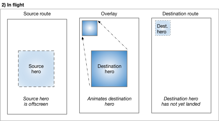
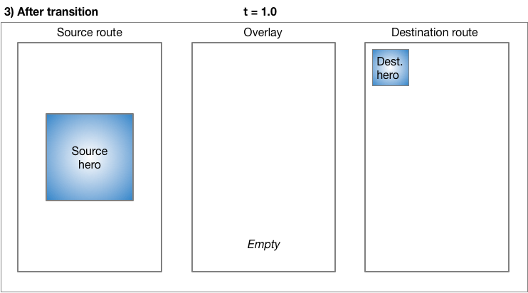
We can create these animations in Flutter with Hero widgets. We all know that hero animates from the source to the destination route, the destination route fades into view. heroes are small parts of the UI, like images, that both routes have in common. From the user’s perspective the hero “flies” between the routes. The below guide shows how to create the hero animations:
Terminology: A Route means a page or screen in a Flutter app.
In this tutorial we will learn two types of flutter hero animations:
Standard hero animations
Radial hero animations
Standard hero animations
A standard hero animation flies the hero between one route to a new route, landing a page or screen at a different location and with a different size.
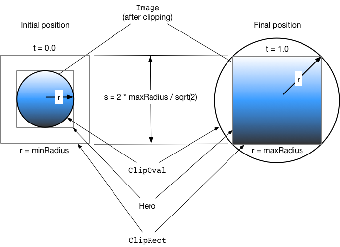
Radial hero animations:
In radial hero animation, as the hero flies in between the routes its shapes changes from circular to rectangular.
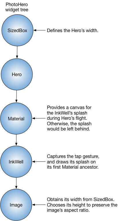
Basic structure of a hero animation
we have to use two hero widgets in separate routes but with identical tags to implement the animation.
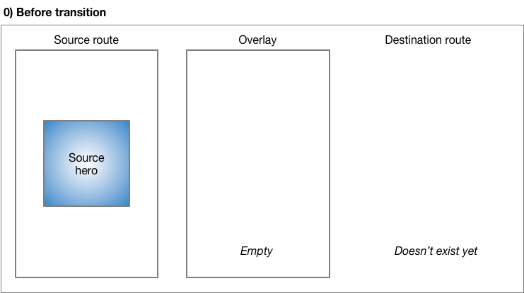
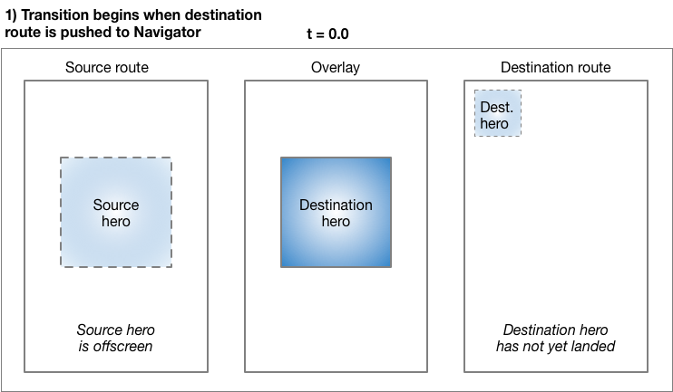
The Navigator manages a stack of the app’s routes.
Whenever Pushing a route on or popping a route from the Navigator’s stack then only it triggers the animation.
The Flutter’s framework calculates a rectangle tween, RectTween that defines the boundary of hero as it flies from the source to the destination route. During hero’s flight, the hero is moved to an application overlay, that’s why it appears on top of both routes.
Hero animations are implemented using the two Hero widgets: one describes the widget in the source route, and another describes about the widget in the destination route. From the user’s point of view, the hero appears to be shared, But only the programmer needs to understand it’s implementation in detail. Hero animation code has the following structure:
Define a starting Hero widget, it refers to as the source hero.
Define an ending Hero widget, that refers as the destination hero.
Then create a route that contains the destination hero. The destination route describes the widget tree that exists at the end of the animation
Now Start Triggering the animation by pushing the destination route on the Navigator’s stack.