Flutter Drop Cap Text

Flutter Drop Cap Text:

In this post, you are going to learn to create drop cap text in flutter for both Android and IOS apps.

What is drop Cap Text?
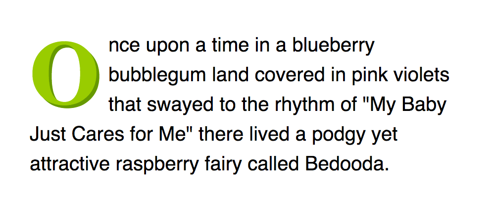
drop cap is a large capital letter is placed at the beginning of a text block or paragraph that drop Cap Letter has the depth of two or more lines of regular text. The following example shows your options for positioning a drop capDropped. In margin.  naturally, signify the beginnings of the text and drop caps can be used instead of paragraph subheads.


Creating Drop Caps In Flutter:

Follow the below procedure to create drop caps text in Flutter.

Add the dependency package:

To use drop cap text in Flutter we need to add the dependency package to pubspec.yaml file. use the below code to add dependency package. After adding the dependency package run the get package method to import all the required files to the app.

dependencies:
drop_cap_text: ^1.0.1

Install the package:

You can install the package from the command line using the below code with Flutter as shown.

$ flutter packages get

Importing the Package:

After, Adding the dependency package to the pubspec.yaml file, you can now import the package into the dart code by using the below code. without adding the dependency package to the pubspec.yaml file if you import it will show package not found an error.

import 'package:drop_cap_text/drop_cap_text.dart';

Flutter Drop Cap Text Properties:

Name Type Default Description
data String null  
mode DropCapMode DropCapMode.inside  
textAlign TextAlign null  
indentation Offset Offset.zero  
dropCapChars int 1  
dropCapPadding EdgeInsets EdgeInsets.zero  
dropCap DropCap [Widget] null  
style TextStyle null  
dropCapStyle TextStyle ( … height: 0.8 … )


Flutter Drop Cap Text Customisation: 

Adding image in place of drop cap text in a flutter. Use the below code to create a drop cap text image in Flutter. In below code we are fetching the network image to use as a drop cap text image and also we are customizing the image width and height as shown in below code.

DropCapText(
loremIpsumText,
dropCap: DropCap(
width: 100,
height: 100,
child: Image.network(
'https://www.iflutter.in/wp-content/uploads/2019/05/flutter-logo.png')
),
),

Flutter Drop Caps for two Characters:

Using below code we are customizing the Flutter Drop Cap texts for two characters, using below code we create two drop cap text letters and height of the drop cap letters and the text we are selecting was a Loren Ipsum text. dropCapChar =2 

by using the above line of code we are getting two drop cap text letters in the beginning of the text as shown in below code

DropCapText(
loremIpsumText,
style: TextStyle(
height: 1.3,
fontFamily: 'times',
),
dropCapChars: 2,
indentation: Offset(25, 10),
),

Creating Upward drop cap:

In this Upward drop cap text, we are creating the drop cap in the first line and above the first line.

As shown in below example code by selecting  “mode: DropCapMode.upwards”

by using this above line of code we are creating the upward drop cap text.

DropCapText(
loremIpsumText,
mode: DropCapMode.upwards,
dropCapStyle: TextStyle(
color: Colors.red,
fontWeight: FontWeight.bold,
fontSize: 120,
fontFamily: 'times',
),
),

Creating the Left Drop Cap Text:

Use the below code to create left drop cap text

DropCapText(
loremIpsumText,
style: TextStyle(
fontWeight: FontWeight.bold,
height: 1.2,
),
mode: DropCapMode.left,
),

Complete Example Code for Flutter Drop Cap Text:

Copy and Paste the below code into your main.dart file

main.dart 

library drop_cap_text;

import 'package:flutter/material.dart';
import 'package:flutter/rendering.dart';

enum DropCapMode {
inside,
upwards,
left,
}

class DropCap extends StatelessWidget {
final Widget child;
final double width, height;

DropCap({
Key key,
this.child,
@required this.width,
@required this.height,
}) : assert(width != null),
assert(height != null),
super(key: key);

@override
Widget build(BuildContext context) {
return SizedBox(child: child, width: width, height: height);
}
}

class DropCapText extends StatelessWidget {
final String data;
final DropCapMode mode;
final TextStyle style, dropCapStyle;
final TextAlign textAlign;
final DropCap dropCap;
final EdgeInsets dropCapPadding;
final Offset indentation;
int dropCapChars;

DropCapText(
this.data, {
Key key,
this.mode = DropCapMode.inside,
this.style,
this.dropCapStyle,
this.textAlign,
this.dropCap,
this.dropCapPadding = EdgeInsets.zero,
this.indentation = Offset.zero,
this.dropCapChars = 1,
}) : super(key: key);

@override
Widget build(BuildContext context) {
TextStyle textStyle = TextStyle(
color: Colors.black,
fontSize: 14,
height: 1,
).merge(style);

if (data == '') return Text(data, style: textStyle);

double capWidth, capHeight;
double lineHeight = textStyle.fontSize * textStyle.height;
double capFontSize = textStyle.fontSize * 5.5;
CrossAxisAlignment sideCrossAxisAlignment = CrossAxisAlignment.start;

TextStyle capStyle = TextStyle(
color: textStyle.color,
fontSize: capFontSize,
fontFamily: textStyle.fontFamily,
fontWeight: textStyle.fontWeight,
fontStyle: textStyle.fontStyle,
height: 0.8,
).merge(dropCapStyle);

//if (mode == DropCapMode.baseline) return _buildBaseline(textStyle, capStyle);

// custom DropCap
if (dropCap != null) {
capWidth = dropCap.width;
capHeight = dropCap.height;
dropCapChars = 0;
} else {
TextPainter capPainter = TextPainter(
text: TextSpan(text: data.substring(0, dropCapChars), style: capStyle),
textDirection: TextDirection.ltr,
);
capPainter.layout();
capWidth = capPainter.width;
capHeight = (capPainter.height * 0.8);
}

// compute drop cap padding
capWidth += dropCapPadding.left + dropCapPadding.right;
capHeight += dropCapPadding.top + dropCapPadding.bottom;

int rows = ((capHeight - indentation.dy) / lineHeight).ceil();

// DROP CAP MODE - UPWARDS
if (mode == DropCapMode.upwards) {
rows = 1;
sideCrossAxisAlignment = CrossAxisAlignment.end;
}

TextPainter textPainter = TextPainter(
text: TextSpan(text: data.substring(1), style: textStyle),
textDirection: TextDirection.ltr,
);

// BUILDER
return LayoutBuilder(builder: (BuildContext context, BoxConstraints constraints) {
double boundsWidth = constraints.maxWidth - capWidth;
if (boundsWidth < 1) boundsWidth = 1; int charIndexEnd = data.length; int startMillis = new DateTime.now().millisecondsSinceEpoch; if (rows > 0) {
textPainter.layout(maxWidth: boundsWidth);
double yPos = (rows + 1) * lineHeight;
int charIndex = textPainter.getPositionForOffset(Offset(0, yPos)).offset;
textPainter.maxLines = rows;
textPainter.layout(maxWidth: boundsWidth);
if (textPainter.didExceedMaxLines) charIndexEnd = charIndex;
} else {
charIndexEnd = dropCapChars;
}
int totMillis = new DateTime.now().millisecondsSinceEpoch - startMillis;

// DROP CAP MODE - LEFT
if (mode == DropCapMode.left) charIndexEnd = data.length;

return Column(
crossAxisAlignment: CrossAxisAlignment.start,
children: [
//Text(totMillis.toString() + ' ms'),
Row(
crossAxisAlignment: sideCrossAxisAlignment,
children: [
dropCap != null
? Padding(padding: dropCapPadding, child: dropCap)
: Container(
//color: Color(0x44ff8800),
width: capWidth,
height: capHeight,
padding: dropCapPadding,
child: RichText(
text: TextSpan(text: data.substring(0, dropCapChars), style: capStyle),
),
),
Flexible(
child: Padding(
padding: EdgeInsets.only(top: indentation.dy),
child: Text(
data.substring(dropCapChars, charIndexEnd),
//rows.toString() + data.substring(2, charIndexEnd),
style: textStyle,
textAlign: textAlign,
),
),
),
],
),
Padding(
padding: EdgeInsets.only(left: indentation.dx),
child: Text(
data.substring(charIndexEnd).trim(),
style: textStyle,
textAlign: textAlign,
),
),
],
);
});
}

_buildBaseline(TextStyle textStyle, TextStyle capStyle) {
return RichText(
text: TextSpan(
style: TextStyle(color: Colors.black),
children: [
TextSpan(
text: data.substring(0, dropCapChars),
style: capStyle.merge(TextStyle(height: 0)),
),
TextSpan(text: data.substring(dropCapChars), style: textStyle),
],
),
);
}
}

Congratulations You Have Learned Creating Flutter Drop Cap Text….!!!

If It Is Helpful Share It With Your Friends….!!!

Leave a Reply

Categories